

Beige colour is a soft neutral between warm white and light brown. It can feel calm, natural, and flexible in British interiors. The right undertone also helps it work with modern, traditional, or period-inspired rooms.
| Quick fact | Detail |
|---|---|
| Standard CSS reference | #F5F5DC |
| RGB | 245, 245, 220 |
| General family | Warm, pale neutral |
| Common undertones | Yellow, cream, pink, grey, or brown |
| Useful pairings | Warm white, navy, sage, terracotta, charcoal, dark brown |
| Common uses | Walls, upholstery, cabinetry, textiles, branding, and web backgrounds |
Beige is a pale, low-saturation neutral with more warmth than grey and less yellow than many creams. The familiar digital reference is #F5F5DC. In homes, it changes with daylight, surrounding materials, and the undertone you choose. It works with warm woods, darker accents, muted greens, and many traditional or modern finishes.
Key Takeaways
- Treat the shade as a family of warm and neutral tones, not one fixed paint colour.
- Check undertones beside flooring, worktops, timber, and fabrics before buying paint.
- Use darker accents when you want stronger definition or better visual contrast.
- Test large samples in morning, afternoon, and evening light before decorating.
- For digital work, verify text contrast rather than assuming a pale background is accessible.
What Is Beige Colour?
This neutral usually sits between off-white, sand, and light brown. Its warmth often comes from small yellow, tan, pink, or brown influences. Cooler versions can contain more grey, which pushes them closer to greige or stone.
The name comes from French and originally referred to natural, undyed wool. That origin helps explain its connection to linen, fibres, sand, and other organic materials. Today, the term covers many pale neutrals rather than one paint formula.
Key Beige Codes and Related Shades
The standard CSS named value is #F5F5DC, with RGB values of 245, 245, and 220. That reference is useful for websites and digital mock-ups. Paint brands use their own formulas, so a screen value cannot identify an exact tin colour.
| Shade | Example hex | How it reads |
|---|---|---|
| Classic neutral | #F5F5DC | Pale and softly yellow |
| Cream | #FFFDD0 | Lighter and more yellow |
| Wheat | #F5DEB3 | Warmer and more golden |
| Tan | #D2B48C | Darker and browner |
| Bone | #E3DAC9 | Softer and slightly greyer |
| Linen | #FAF0E6 | Pale, warm, and close to off-white |
Use these codes as digital references, not universal decorating matches. Screens, print processes, and painted surfaces reproduce colour differently. Physical samples remain the safer choice when matching walls, furniture, or finishes.
Warm and Cool Undertones Matter
Undertone determines whether a pale neutral feels creamy, sandy, rosy, or stone-like. Warm versions suit timber, brass, terracotta, and other earthy finishes. Cooler versions can sit comfortably beside black, cooler stone, or muted grey accents.
Natural light can shift the same sample throughout the day. North-facing rooms may make warm shades appear quieter or greyer. Stronger daylight can reveal yellow or pink notes that looked subtle under artificial lighting.
Place samples beside permanent features before choosing a wall shade. Flooring, worktops, tiles, fireplaces, and large sofas affect how neighbouring colours appear. This approach prevents a pleasant sample from looking mismatched after the room is finished.
What Colours Go With Beige?
The strongest pairings either echo the warmth or add deliberate contrast. Soft combinations create a calm room, while darker accents add structure. Your existing flooring and furniture should decide which direction makes sense.
| Partner colour | Effect | Where it works |
|---|---|---|
| Warm white | Light and layered | Ceilings, trim, kitchens |
| Navy | Deep, classic contrast | Living rooms, cabinetry |
| Sage green | Soft and natural | Bedrooms, kitchens |
| Terracotta | Warm and earthy | Dining rooms, accessories |
| Charcoal | Modern definition | Metalwork, furniture, details |
| Dark brown | Rich tonal depth | Timber, leather, rugs |
| Dusty pink | Gentle warmth | Bedrooms, soft furnishings |
| Black | Crisp contrast | Frames, lighting, hardware |
For a softer scheme, repeat related neutrals across walls, fabrics, and natural materials. For a stronger scheme, add one dark anchor and repeat it several times. Repetition helps the palette feel planned rather than accidental.
Room-by-Room Ideas for UK Homes
In living rooms, a pale neutral can provide a quiet background for artwork and timber furniture. It also works well with painted wall detailing and simple mouldings. Pageify’s wall panelling ideas can help you add texture without relying on stronger colour.
Bedrooms often benefit from softer, low-contrast combinations. Pair warm neutral walls with off-white bedding, oak, muted green, or dusty rose. Keep the ceiling lighter if you want the room to feel open.
Kitchens need coordination with cabinets, worktops, flooring, and metal finishes. A warm backdrop can soften white units or connect wood with darker stone. Pageify’s breakfast bar guide also covers materials, lighting, and finishes for practical kitchen planning.
Bathrooms require more than a pleasant wall shade. Tiles, grout, lighting, and moisture-resistant finishes should work together. Pageify’s bathroom floor tiles guide explains how appearance and practical performance need equal attention.
Beige vs Cream, Tan and Greige
Nearby neutrals can look similar on a small screen or sample card. The key differences are usually depth, warmth, and grey content. Comparing them side by side makes undertones easier to spot.
| Neutral | Typical character | Best description |
|---|---|---|
| Beige | Warm, muted, pale | Between cream and light brown |
| Cream | Lighter, yellower | Warm off-white |
| Tan | Darker, browner | Earthier light brown |
| Greige | Greyer, cooler | Mix of grey and warm neutral tones |
Cream usually feels brighter because it sits closer to white. Tan brings more brown and visual weight into a room. Greige reduces warmth and can suit schemes built around stone, black, or cooler metals.
How to Choose the Right Shade for a Room
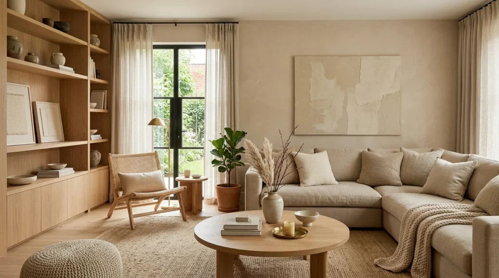
Start with fixed finishes rather than a paint chart. Pull likely undertones from flooring, worktops, tiles, or large furniture. Then choose samples that repeat or gently balance those colours.
Test broad samples on more than one wall. View them during daylight, after sunset, and under the room’s normal lamps. A sample behind a sofa can look different beside a window.
If you are adding decorative wall detail, decide the colour after planning the proportions. One-tone panelling can make texture feel calmer and more modern. Contrasting sections create stronger lines and can suit larger or brighter rooms.
Using the Shade in Digital Design
The CSS named colour has a defined value of #F5F5DC. That makes it easy to reproduce consistently in browsers. Designers can also adjust nearby values when a warmer or greyer background suits the brand.
Pale backgrounds still need suitable text contrast. WCAG guidance requires at least 4.5:1 for normal text in most cases. Dark charcoal or near-black usually gives clearer separation than white text.
Do not use colour alone to communicate status, errors, or selection. Add labels, icons, underlines, or other visible cues. This keeps the interface understandable for users who perceive colours differently.
Common Decorating Mistakes to Avoid
The first mistake is choosing from a tiny swatch. Pale neutrals can change noticeably across a whole wall. Large samples expose undertones that small cards can hide.
The second mistake is mixing several warm neutrals without checking them together. One may lean pink while another leans green or yellow. Place samples side by side before buying paint, fabric, or flooring.
The third mistake is making every surface equally pale. Rooms often need contrast through timber, artwork, hardware, rugs, or darker furniture. Without variation, even a carefully chosen palette can feel flat.
Frequently Asked Questions
What is the hex code for beige colour?
The standard CSS reference is #F5F5DC. Its RGB values are 245, 245, and 220. Paint colours with similar names can use different formulas, so you should sample them physically.
Is this neutral, warm, or cool?
It is usually warm, but undertones vary. Yellow and brown notes make it warmer, while grey makes it cooler. Always compare the sample with the room’s permanent finishes.
What colours make a room look modern with this neutral?
Charcoal, black, navy, sage, and warm white can all create a modern scheme. The result depends on materials and proportions, not the accent alone. Repeat key accents so the room feels connected.
Does it work in small rooms?
Yes, especially when the shade is light and the room has a clear contrast plan. Keep bulky furnishings and window treatments in proportion. Use mirrors, lighting, and uncluttered surfaces to support the sense of space.
Should walls and woodwork match?
Matching walls and woodwork can create a softer, more continuous look. Contrasting trim gives doors, skirting, and mouldings stronger definition. Test both approaches beside flooring before making a final decision.
Bring the Palette Together
This neutral works best when you treat it as part of a complete material scheme. Start with fixed finishes, test large samples, and check the room at different times. Then add contrast through timber, textiles, metalwork, or deeper accent colours.
For related decorating projects, Pageify also covers shed paint and exterior colour planning. Coordinating indoor and outdoor neutrals can make a property feel more considered. Keep practical surface requirements ahead of colour when choosing exterior products.